Swedish globalisation advocate Johan Norberg looks up a picture in a beautiful Italian church, and sees an early sign of where individualism comes from. Nice thoughts, succinctly expressed.
|
|||||
|
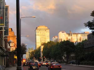
“Spectacular City – Photographing the Future”. Photographic exhibition at the Netherlands Architecture Institute, Rotterdam, until January 7, 2007, and then touring, to the NRW Forum in Dusseldorf and subsequently to further venues. 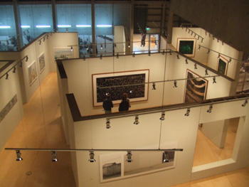 One of the great things about the internet is that it is possible to start on a familiar blog, and end up not much later at somewhere you would not have imagined being a couple of links before. And sometimes, the virtual world gets left behind, and you end up somewhere in reality you weren’t expecting to be. For instance, on Tuesday of the week before last, I started at the blog of Willam Gibson (the famous William Gibson), and before I knew it I was simultaneously at the delightful Japan Probe and the website of the Netherlands Architecture Institute, which was apparently featuring an exhibition entitled “Spectacular City”, which was a phtographic exhibition of modern urban buildings, supposedly attempting to reveal things about cities through photographs of their less observed details. The blogged photograph on the immediate link, the Ministry of Transportation in Tbilisi in Georgia, made the exhibition look promising, especially given that I enjoy looking at modern uses of Soviet architecture at least as much as the next guy. As I am also someone who loves few things as much as visiting suburban shopping malls, housing estates, and transport infrastructure in foreign cities, I was intrigued. I checked the location of the architecture institute in question, and was gratified to discover that it was not in Amsterdam but in Rotterdam. This is a fitting place for it. In the sense of modern architecture, Rotterdam is one of the more interesting cities in Western Europe, although one or two Spanish cities have been making a good claims recently. The combination of a city completely flattened by bombing, and a lack of the architectural timidity of London or the pomposity of Paris (and the perhaps not coincidental fact that Rotterdam post war became one of the key points of European transport infrastructure – more on that in my next post) led to a really interesting, experimental, and modern (in the best sense) city being created. However, the real reason I was gratified was that it meant that the exhibition was relatively easy for me to visit. By a strange coincidence, I was planning on being in Antwerp a few days later, in order to go to the slightly naff Belgian/Dutch/German version of Night of the Proms, which is somewhat less musically rarified and much more poppified than the British version, but is none the less rather good fun. That took me up to Saturday night, and my train ticket back to London was for Sunday evening. My plans had been to spend most of Sunday pottering around in Antwerp – a nice city for it – but Rotterdam is only an hour north by train, and there was nothing stopping me from nipping up to Rotterdam on Sunday and having a look for myself. 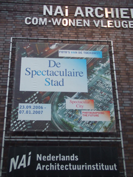 (Quick summary of the Belgian Night of the Proms: given that Tears for Fears were a band with two strong vocalists who wrote and performed somewhat overblown songs with a huge instrumental backing, they are never going to be better than accompanied by a full orchestra, a 40 strong choir on the back of the stage, three aesthetically pleasing front of the stage backing singers, and assorted drummers, pianists, and other musicians. Given also that there are a band whose repertoire really only consists of three really good songs and about four or five good ones, not terribly much is lost through their sharing a bill with other performers. On the other hand Texas are a group of slightly more musically sparse Glaswegians, and are probably better by themselves with a full set: more songs, less embellishment, and fewer distractions. Also, when they were performing the three aesthetically pleasing backup singers had changed into the most interesting of their thirty seven different costumes for the evening: outfits consisting of rather tight jeans and red corsety things that were probably illegal in Korea until recently. Male weakness meant that I was distracted. But none the less, it was a fun evening. It may not have been as fun if it had been in London, but Belgium was the right place for it). In any event, architecture. Rotterdam. If you are a building, being the Netherlands Architecture Institute is probably like being the Vienna Philharmonic if you are an orchestra. Everybody expects you to be the Vienna Philharmonic. This is probably a bit much on an evening when you have been to the pub and have had one too many. And the NAI is a decent building trying a bit hard, but nothing really special. 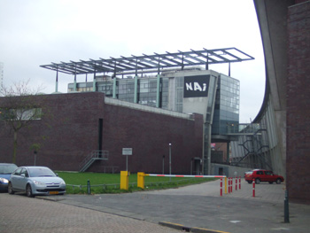 Walking into the building and into the exhibition the first thing I saw was an aerial photograph of Paris inside the Periphique: the Eiffel Tower, the wide Boulevards designed by Baron von Haussman, practically picture postcard stuff 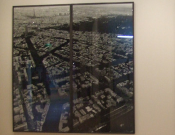 I steeled myself for disappointment with respect to the exhibit. Paris inside the Periphique is not a city that has grown from its lesser observed pieces. Paris inside the Periphique is a city in a corset, almost literally, although in this instance of a kind legal (and probably fairly common) in Korea. The city is full of legally protected buildings, height restrictions, prohibitions on selling newspapers in cafes, and worst of all, buildings owned and designed by governments. There is modern architecture, but it is monumental and government sanctioned. The city boundary corresponds with the aforementioned Periphique, an elevated motorway that surrounds the city, seemingly holding the picture postcard Paris within. The City is just a museum – it is full of governent but does not seem to have any sort of functional wealth generating economy within. It is beautiful, but it isn’t interesting. Paris outside the Periphique is much more interesting. → Continue reading: In between 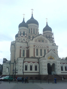 I think that this building (the Alexander Nevsky Orthodox Cathedral in Tallinn) is every bit as assertively a statement that the Russians are in charge as is the Palace of Culture in Warsaw I wrote about earlier this year. It comes from a different Russian era (the Cathedral is a Czarist structure, completed in 1900), but I think the motives for building the two structures were not too different . Certainly the Cathedral is in every bit as prominent a location as the Palace of Culture – it is on the top of the Toompea hill in Tallin’s Old Town, directly opposite Tallin castle (now the Estonian national parliament). Certainly, also, it is every but as architecturally out of character from the historical city, which in style is a typical Baltic Hanseatic League city, although the people of the city are clearly very proud of the medieval town hall 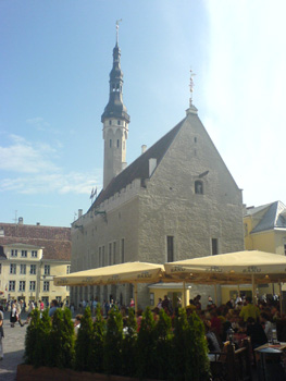 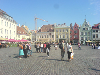 It is only six years since I was last in Tallinn, but the city certainly seems to have come a long way since then. At that point the Old Town was beautiful, but the rest of the city felt grimy when I left it. No longer. It’s not a terribly large city (half a million?) and it is not as frenetic as some larger cities, but it has the air of a place becoming, well, comfortable. Modern office buildings going up. Suburban tracts of nice, large houses being built on the waterfront to the west of town. That kind of thing. There are lots of Soviet housing estates between the old centre and the nice suburbs, but in truth I have seen worse in London. And Paris. And Amsterdam. It is difficult to believe that this was part of the Soviet Union only fifteen years ago. But it was. And it was certainly a nice touch to be able to talk to friends in Australia using a software product that was developed here. The computer markets of China are full of people attempting to sell you cheap Skype handsets. However, Tallinn gave us Skype itself. That is worth more. Most of us are familiar with Parkinson’s Law, the one that says that work expands to fill the time available for its completion. However, a TV news report last night, discussing one of the recent travails of Britain’s Home Office in front of its recently constructed and newly occupied headquarters reminded me of another Parkinson’s Law – same Parkinson but different law – which says that whenever an organisation moves into a new, custom-built headquarters, it is likely to be not just heading for disaster but already there. Parkinson’s Law of Custom Built Head Offices alludes to the way that the process, first of deciding about the new building and then of getting settled into it, takes the attention of the people who matter away from the real job that they are supposed to be doing, and towards their own, as it were, domestic arrangements. They are celebrating past successes instead of contriving further success. Contrariwise, people who are busy doing important and productive work that they are determined to press ahead with have no time to be fussing excessively about furniture and fittings, and they make do with whatever they have or can easily obtain from a catalog. Once again, this law would appear to vindicated, and I can only apologise for not noticing this sooner. I’ve long known of this law. I often walk past the new Home Office, designed by star architect Sir Terry Farrell, on my way from my home to Free Market Think Tank Land, which is just the other side of the new Home Office from me. The Home Office’s very public difficulties in recent months have not escaped me. But the penny did not drop until last night. The new Home Office was moved into in the Spring of 2005. Interesting how these things get around. The word of these amazing photos of Mexico City got to me from him, who got it from him, who got it from him, who apparently found them here, which is where, for me, the trail went cold. The picture Patrick Crozier chose to reproduce is particularly extraordinary. Talk about ‘fake but real’. Something to do with how the guy photoshops the pictures to make things clearer, I am guessing. I often do the same with shots I take from airplanes. Architecturally, I think this is particularly bizarre. There are times, may the God Who Does Not Exist forgive me, when I yearn for a violent revolution in sleepy little Britain, just so that the planning permission (i.e. non-permission for almost anything remotely interesting except when the government wants it) system collapses, and people could build, in Britain’s still overwhelmingly green and pleasant land, whatever crazy thing they liked. Just as a for instance, why are there not more castles built nowadays, with cylindrical and pointy towers? Mind you, extraordinary things are still being built in Britain, by the sort of people who are still allowed to do such things. 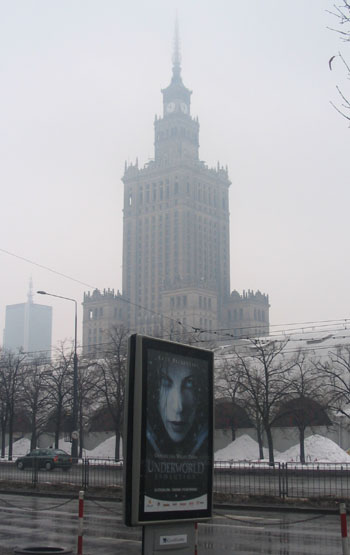 If anyone (or thing) is looking for a heaquarters from which to run the centuries old war between Vampires and Lycan, I do think the building is perfect, however. (For people who are wondering, the building is the Palace of Culture and Science in Warsaw, built in 1953-5 as a gift from the people of the Soviet Union to the people of Poland). While trying to sort out my thoughts concerning the mayhem engulfing the huge public housing projects ringing Paris for the last week or more (11 days’ running) it struck me that one of the basic problems is just how dreadful is the style and character of the architecture of such places. Among the many contributory factors to the present dismal mood in poorer parts of France, it seems to me, is the relentlessly cheerless atmosphere of such places. Many of the buildings are vast tower blocks, without gardens or private enclosed spaces. Long walkways – ideal for muggers and drug dealers – connect the blocks. Without an organic sense of place, there is also a lack of spontaneous neighbourliness that is much easier to create in a terraced street. I am not going to push this point too far. The terraced housing areas of north-west England were scenes of violence involving young Britons from different ethnic groups only a few years ago. If the French government were to demolish the greying monoliths tomorrow and replace them with low-rise homes, it would hardly represent a major advance towards solving the problems of that country. But I think it would have an effect. Perhaps someone should send a copy of Jane Jacobs’ The Death and Life of Great American Cities to Jacques Chirac and his cabinet as a matter of urgency. Compared to some of the advice the French administration may be getting, they could do a lot worse. Let’s not forget that one of the high priests of Modern Architecture, Le Courbusier, was Swiss (born just over the border from France), and had a huge impact on thinking about mass public housing for much of the 20th Century, and also influenced thinking in other parts of the world, including Britain. To be fair, though, I resist the fogeyish habit of damning big modern buildings across the board. I agree with fellow contributor Brian Micklethwait that there is good modern architecture that can work brilliantly and crappy modern architecture that does not. When it comes to mass housing, though, Modernism seems to be seriously unnattractive in every sense of the word. (Correction: I originally said that Corbusier was French. He was not – by a matter of a few miles. Thanks to a commenter for setting me straight). Meanwhile, here is a grim update on developments. Last Monday, England won the Ashes. (If I tell myself this often enough, I will eventually believe it.) And when I mentioned this fact (for fact it is) here, I mentioned also the rather fine new stand that they have just built at the Oval, where that final clinching game of the series was played. Today I walked across the river to the Oval and took some photos of this new stand. And I have done a posting about how it looks at my personal blog, together with some pictures snapped from the TV coverage. And then I found this really great picture of it that someone else took: 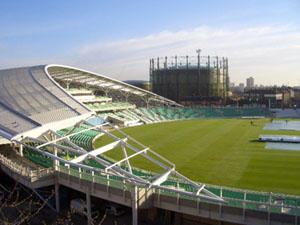 Last Tuesday, London celebrated England winning the Ashes, and I also went along and took photos of that. They are not perfect photos, if only because I had such a lousy view of the proceedings. I ended up taking a lot of snaps of the giant TV screen they had behind everything, just as if I had been at home. But, this giant screen yielded some fine imagery, with no interference patterns or surprise black horizontal splodges of the kind that I get when I photo my TV at home, and I am very happy with the photos I did manage to take. You can see my favourites ones here. Some of favourite pictures were of the words they stuck up for us all to sing: 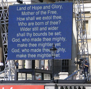 So there you have it. England won the Ashes because God was on our side. Long ago, when I was “reading architecture” at Cambridge University (it turned out that you had to do more to architecture than merely read it if you wanted to become an architect), I remember noting the name of Japanese architect Kenzo Tange. The majority of the architectural gods we students were then offered as objects of worship turned out to be deluded fools, but Tange was, I believe, the genuine article. And now he has died, at the age of 91. I had no idea that he had lived this long. I think he deserved to, and that if for some reason he did not look back on his work with a sense of pride and accomplishment, he should have and was entitled to. I know that many readers here loathe the architectural modernism that is being done now, just as they loathe the architectural modernism that was done in the sixties and seventies. But for me, there has been a sea change. Style is back. Expressiveness is back. The Great Lump style is being abandoned, and often dynamited. If they look at these pictures, I think that at least some readers here may agree that this man was way ahead of his time. Now, modernistic buildings which look interesting rather than deadly dull, which celebrate the expressive possibilities of modern building technology instead of merely using it to erect giant blocks of boredom, are all the rage. Tange did perpetrate quite a few concrete lumps, but on the whole, he did better than that. How many other architects were making buildings as interesting and dramatic looking as this, in the nineteen sixties? Not many. The big news in the London architecture scene just now is the fact that Ken Shuttleworth has left Norman Foster and is branching out on his own, with a new practice called simply: Make. And Make are making a huge public splash already, with this: 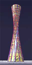 The Vortex, it is already being called. “Ken Shuttleworth”, I realise, sounds like one of the barmier characters in The League of Gentlemen – but believe me, if you know who this guy is you soon forget that. He was the creative brain behind the Erotic Gherkin. He was also the creative brain behind the Millenium Bridge, the one which so famously wobbled when it was first opened. But the wobbles have been long fixed, and that, like the Gherkin, is now an instant London landmark, with the view of it from Tate Modern with St Pauls in the background now being a favourite London picture postcard. Just as the Gherkin could have, the Vortex could end up looking horribly kitsch, like a giant lamp fit only for a car boot sale. But I hope and trust that, if Shuttleworth does get it built, he executes it as well as he executed the Gherkin, which all of London (that I know of) reckons is superb. The design rationale of The Vortex is twofold. First, although the shape is beautifully curvy, it is a shape made entirely out of straight lines, which makes it a whole lot easier to build than it looks. Not easy mind, just easier. And second, the big rents in buildings like this are charged at the bottom and at the top, apparently, so the logical shape for such a beast to be is thick and bottom, thick and the top and thinner in the middle. The Vortex obliges perfectly, and as an intrinsic result of its shape. But the most interesting thing of all about this building, to my way of thinking, is the fact that Shuttleworth has designed it, and announced it, before he knows where it will go. This is fascinating. Design the building, in rough outline. Then advertise it. Then get the money together and get the politicians excited, and sort out where to put the thing. This makes perfect sense. It also flies in the face of much architectural orthodoxy about how the building has to blend into its surroundings, which I rather like. Because this thing will, if done well (Shuttleworth style), blend in with anything. No doubt there will be Americans commenting here to the effect that edifices like this spoil Disneyland-London, which exists entirely for their amusement by being the opposite of New York and Chicago. They should know that I vehemently disagree. The business of London is business and it always has been, and you can’t do business only in cutesy little historical type buildings. London is a living city, and plans like this are all part of why it is living particularly vivaciously just now. The idea is, of course, that the Vortex should be built in London. But since they haven’t fixed on a particular place for it yet, there is no reason why it couldn’t be built in Shanghai instead, or in Shanghai as well, and bigger. I could live with that. The evening sun that illuminated one of my favourite views near where I live was especially dramatic this evening. And this little photo of how things looked is surprisingly effective I think. Even the little thumbnails I got I scrolled through all the pictures in Photoshop to choose a good one looked rather impressive. But if you would like to see this rather bigger, then click on it. I suppose there are some readers of this blog who will say, when confronted by images like this: what has this got to do with blah-blah-blah-ism (or whatever word they choose to give to the political assumptions and axioms we tend to favour here)? But, even though many readers may be puzzled, the fact is that our standing orders here are to write about what is on our minds. And what was on my mind when I went shopping earlier this evening was not the EU or the level of taxation or the importance of consenting relationships. It was how beautiful that usually quite mundane building over towards the river can look when it catches the evening sun just so, and especially when the sky behind it is also doing dramatic things of its own. This kind of thing does make me want to have a more expensive camera, though, plus some lessons in how to use it. Because what my cheap little camera shows you is only a pale shadow of what I myself saw. We have a posting category called “How very odd!”. Now I want one for “How very beautiful!” Meanwhile, “Architecture” will have to do. Not everyone who reads this blog will be particularly keen to know what the new EUropean Parliament building in Brussels looks like. But if you would like to know about this, I have a posting up at my Culture Blog which starts with a huge aerial photo of the place taken by someone else, and then has twenty four thumbnail photos you can click on to get to bigger photos that I took myself of this vast building when I was myself in Brussels not long ago. It has taken me more than two months to get around to exhibiting these photos, for which apologies, but I presumably things have not changed that much since I took them. Partly this was because until recently I had much to learn about how to do this – “thumbnails” etc. (merci Monsieur) – and partly it was that, even if you do know how to stick up a mass of these thumbnails, it is still (for me anyway) a very unwieldy process to actually do, and to actually arrange them in a semi-coherent order, especially since this was the first blog posting effort along these lines that I have attempted. The building is a scarily impressive edifice, or rather, agglomeration of edifices. I really missed not having a wide angle lens. As it was, it was like trying to photograph an elephant in a crowd. All I could do was assemble lots of details (hence the need for lots of pictures), with only occasional views that got the bigger picture, and none of the whole thing. Which is only appropriate, considering that this is the EU, and that this entire building is itself only a relatively minor part of the big EU picture, which is itself utterly impossible to get in one snap. |
|||||

All content on this website (including text, photographs, audio files, and any other original works), unless otherwise noted, is licensed under a Creative Commons License. |
|||||
