Not that I intend to die, but when I do, I don’t want to go to heaven, I want to go to Claridge’s.
– Spencer Tracey, quoted in the TV show Art Deco Icons, shown on BBC4 earlier this evening.
|
|||||
|
Not that I intend to die, but when I do, I don’t want to go to heaven, I want to go to Claridge’s. – Spencer Tracey, quoted in the TV show Art Deco Icons, shown on BBC4 earlier this evening. I have frequently noted here the obsessive fortification of the state during the last decade: how all public buildings in Britain have steadily become the opposite – closed-off, accessible only through guardrooms, by special permission. A fascinating and frightening piece by Anna Minton in the FT Locked in the security cycle describes something I did not know. Though I had noticed a more general neurotic security obsession in new developments, I thought this was merely a matter of insurance and corporate cowardice. Some of it may be. But some of it is official coercion. Minton explains:
Beware the security-industrial complex! Note this is enforced by state power: since the all-nationalising Attlee government of 1945-51 planning permission controls all building in Britain. It is a panopticon of the built environment, covering all significant building or alteration of building: nothing is legally done privately; nothing is legally done without prior official approval. So “a prerequisite of planning permission”, means developers comply or they don’t build. But the standards to be applied by planning officers are controlled by a ACPO – a closed professional body for senior police and civilian policing officials – and far from correcting the producer interest, as choice might, deliberately incorporate it as a driving factor. What will we get – what are we getting – all around us? An architecture calculated to reproduce the assumptions of those in security positions and industries of what’s a good place for people to live, trade or work, for children to play or be educated. Those are assumptions about order, ‘appropriate’ persons and behaviour, the need for oversight, the nature of – and constant presence of – threat. Hence the suspicious building syndrome: you will be increasingly screened to permit entry, and watched, controlled inside the perimeter. Hard, plan-defined boundaries, rather than freely negotiated common use of space. But look! Lots of jobs for guards and electrical maintenance crews. Compliance by large builders will make their lives easier and competition more difficult. ACPO members will find valuable consulting work. Politicians can say we live in a society with “world class” security. The execution of policy will be deemed its success. Everybody (who matters) wins. Positive feedback. But not the only feedback loop. The authorities are not interested in contrary evidence. Public bodies and quangos are skjlled at commissioning proleptic studies, and the institution of ‘public consultation’ is highly developed as an art of obtaining affirmation for policy, but even so, there are clear signs that that official security obsession creates psychological insecurity in the populace. Minton again:
[my emphasis] I would add: they also remind us of something else. The pressure for all this comes from regulatory culture. As with the fortification of the state, it reveals and propagates the intense fearfulness in authority itself. Authority is frightened of the unsupervised individual, and thinks we should be too. To recycle a phrase, they hate our freedom. The possibility that life may be lived harmlessly in divers ways is just as much anathema to a secular bureaucrat as a religious totalitarian. If rules and fear are not everywhere, we might not accept that the people who make up rules always know best. And not just in the obvious way, by selling me interesting books, cheaply, that I might not otherwise be able to get hold of. It happened like this. The block of flats I inhabit has a door at the bottom which each of us can unlock from our flats with a remote control button, without seeing who we are letting in. This makes us vulnerable to robberies. What happened was that the buzzer went, and one of us would pick up his phone. A voice would say: “I am the postman”, or “I have a delivery for number 22”, or “I have come to read the electricity meters”, or “I live in number 29 and I don’t have my key on me”. It only needed one such person to be a plunderer and a liar, and one trusting householder to trust the liar, and the liar was inside the building able to steal any enticing parcels from the post boxes just inside the front door. We don’t have a concierge, and we don’t have postal boxes that are locked. (Which may be why blocks of flats are now, more and more, big. They are big enough for all the dwellers in them to be able, between them, to afford a concierge.) So anyway, this all makes it impossible for me now, in full confidence, to receive purchases from Amazon. They get delivered fine. But they are then liable to be stolen. We have all learned about this, and I for one do not let people in without coming down and personally seeing them in and out. I get the impression that robberies have now abated, and the robbers have moved on. But, why take the chance? Why not, instead of getting Amazon stuff delivered to a home like mine, get it delivered to the home of a friend with no such problems, just his own single front door? Why not drop by every now and again to collect whatever Amazon stuff you order? So it is that, instead of getting Amazon stuff for me delivered to my own home, it now all goes to Chateau Samizdata, the home of Perry de Havilland. And so it also is that I have yet another excuse for dropping by to visit Chateau Samizdata every so often, every time stuff needs collecting. This is good in itself. There is nothing like face to face contact with good friends. Samizdata is all very virtual and twenty first century and all, but it started when people met each other face to face, and it works better if we keep on meeting in this old fashioned way from time to time. But travelling to Chateau Samizdata has another benefit, for me. → Continue reading: How Amazon is causing me to read more books and read them better While delighting here in the new camera I bought early this year, I included a picture of a new building, then being constructed in Victoria Street, London SW1, near where I live. 62 Buckingham Gate is now nearly finished. In February, as already show in that earlier posting, this was how it was looking: There was a time when a building which looked like that when it was being built would end up looking pretty much like that when finished. This was the time of such architectural enthusiasms as “New Brutalism”, a time better know to civilians as the age of Concrete Monstrosities. And that building above would have carried on as the misshapen oddity that it was when being constructed, looking like it had been put together by a bunch of builders who got drunk every breakfast time, while supervised by an architect who was suffering from a nervous breakdown. But now look at it: Yes it’s another contribution to the Buildings That Won’t Show Up On Radar style, already noted in an earlier posting I did here about One New Change. Here is another example of the style. Partly, as I already mused in that One New Change posting, architects now do this kind of thing because they can. Whatever new thing they can do at any particular juncture in architectural history tends to get exaggerated and turned into a style. And they can do this kind of geometrical weirdness because now they have computers to enable them to keep track of it all, as they did not during the Concrete Monstrosity era. They also have better technology, including such things as greatly improved glass of many different kinds, from which they can pick the exact one that is most suitable for their particular building. But there is also a deeper change in play here, a change of aesthetic philosophy. → Continue reading: 62 Buckingham Gate nears completion Early yesterday evening, taking advantage of a small window of nice weather in our mostly appalling British “summer”, I took a stroll across the river. I ended up in the London Bridge area, where, just before descending into the Tube to go back home, I took this picture: 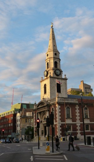 That is a church called Saint George the Martyr. Now, you may think that this church is behaving itself, but actually, it is seriously interrupting the view of the recently completed Shard. To show you what I mean, here is another picture which I took seconds later: 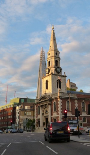 Now you see it, now you don’t. I’m just kidding (I had in mind sentiments like this) about the church being an eyesore. Saint George the Martyr looks very nice, and I find these two buildings particularly pleasing when they are thus aligned. Earlier I had taken another picture of St George the Martyr and the Shard, but from further away. The church looks smaller, just as you would expect. But the Shard looks bigger the further away you get from it, because it becomes so much clearer that it actually is so very big, and so much bigger than everything else. 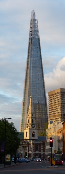 My more serious point is that the Shard, far from being an alien and intrusive presence, actually fits into big old London very well indeed, not least because it echoes some of London most characteristic and most loved architectural shapes. That’s what I think, anyway. Some declare themselves offended by the Shard, as has already been noted here. But for me, London without its recent crop of skyscrapers would be a less appealing and far duller place. Had the Shard only got as far as the pretend photo stage, but had it never actually materialised, I’d have been very sad. If lack of money had caused that, well, that happens, when boom turns to bust. But had the Shard been politically aborted because of its alleged aesthetic offensiveness, I would have been offended myself. While rootling around in my personal blog archives chasing up something else, I recently found myself looking again at this 2007 posting, about what looked like being a really cool tower, in Chicago. So, I wondered, did they actually build it? Indeed they did. Here is a good photo culled from amongst these, which I found here: 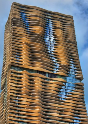 I also particularly recommend these photos, which say “^John Picken- flickr/cc license” in among them, so I’m guessing that means don’t copy without asking, so I didn’t. But that needn’t stop you looking at the photos where I found them. LATER: Wrong. “cc” means (see comments) creative commons. (I thought it meant copyright only more so.) So here’s another picture: 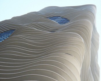 It’s called the Aqua Tower. Likes and dislikes in architecture are very much a personal matter. One man’s masterpiece is another’s mediocrity or worse. But I liked the idea of the Aqua Tower when I encountered it five years ago, and judging by the photos I’ve seen, I would like the reality of it now, if I were to see it in the flesh. It is truly remarkable how similar the photos of this building are to the imaginary pictures of it when it was first announced, which is not always how it is, to put it mildly. Says this:
Which is a more detailed version of what I said in 2007:
I also learned, here, that the Aqua Tower is the tallest building in the world designed by a woman. Her name is Jeanne Gang. Meanwhile, the men have not stopped trying to outdo each other. You suspect that with that building, we are back with “impractical interior spaces for the honor of architectural aesthetic”. And speaking of impractical interior spaces, at any rate towards the top, here in London, the Shard is nearly done, and is looking very good, or so I think. I entirely realise that this latest phase in the history of architecture has been fuelled by silly money. But when you consider what else this money has also been spent on, I say thank heavens we at least have some good looking stuff to show for all the agony. I am always on the look out for new spots from which to look out over London and take photos. Last week, I discovered another such place, on the roof of something called One New Change, which is a big new shopping centre right next to St Paul’s Cathedral. The weather during the last few weeks has mostly been vile but during a brief break in this weather, I journeyed to One New Change to check it out, and in particular to see if I could go up to its roof and take photos. Internet omens seemed good, but you never really know about such things until you get there. Here is the entrance I used to get inside One New Change: Click on any of these pictures if you want to see them bigger. Modernist architects used to be fond of a phrase to the effect that form should follow function. But the truth is that when it comes to architecture, form tends to follow not function but fashion. To be fair to the architects, fashion tends also to follow what is technologically possible. At any given moment in modern architectural history, architects have asked themselves: what does building technology now enable us to do which we couldn’t do half a decade ago, thus enabling us to get passers-by to say: Wow, look at that. Is it fair to call this “fashion”? I think so. After all, that is surely how the fashion business itself tends to operate. So it is with One New Change. Only if you already knew, as I already knew when I went looking for it, would you have known that this is a shopping centre. It could have been a university, an office block, an “arts” or “community” centre, a library, or any one of half a dozen other things. But, you can tell at once that it was only very recently constructed, because here is a building done in the planes of glass at bizarre angles style. Which is a very recent architectural fashion. (One of the growth service industries of our time is presumably specialist window cleaning, of windows that are not easily reached by the usual methods of simply hanging a platform out over the vertical edge of a building and then just going up and down and side to side.) Where did this style come from? Much of it, as I say, is a case of “because we can”. Glass has got a lot stronger and cleverer in recent years, as have building materials generally. And now that architects have computers to keep track of everything, they can design – and more to the point can build – buildings made in these bizarre shapes. Another influence at work on modern architecture generally and One New Change in particular is, I surmise, ships. Modernist architects have always been envious of and heavily influenced by ship designers, because with ships, form really does have to follow function, far, far more than is the case with most buildings. Many a nineteen thirties block of flats, with its long horizontal outdoor walkways and curved corners, was designed by an architect with his head full of ocean liner imagery. More recent ships, of the stealth sort, now offer further “inspiration”. My first reaction to One New Change was that here was a building that was trying to avoid being spotted on anyone’s radar. Which is a very reasonable thing for a building to want to do if it is only a stone’s throw from St Paul’s Cathedral. So anyway, I went in through this entrance, and found escalators, and a big lift shaft. I decided to try the lift. Early indicators, in the form first of the lift, and then in the form of this very striking view of St Paul’s from this lift, were very good: That’s a rather wonkily angled photo, what with the lift being in motion and me having only one go at it. Plus, it looks misleadingly dark, on account of me looking towards the afternoon sun. But I like it anyway, because of the sky and the reflections and St Paul’s. Nobody tried to stop me getting into this lift, as the somewhat warlike appearance of the outside the building was perhaps subconsciously suggesting to me might have happened. I just pushed the usual buttons, just as in any other shopping centre, or for that matter big department store, and up I went. The lift itself, made from reassuringly solid slabs of that new and clever glass that I have already mentioned, was clearly designed with the viewing experience of those travelling in it very much in mind. It isn’t buried in a lift shaft. Rather is it hung out on the inside of the building, as happens in grand American hotel lobbies that you see in movies. And a slice has been cut from top to bottom through the building to enable St Paul’s to be visible from this lift, throughout one’s ascent. All of which strongly suggested that a similar concern for viewing pleasure might also prevail at the top of the building. The lift rose upwards, and my level of photographic optimism rose with it. When I got to the top, nobody made me buy a ticket or tried to check my bag or any such thing. And I was right to be photographically optimistic: Things seem to be a bit quiet here this weekend, so here’s a picture I took earlier this evening: Click to get it bigger. This is not Photoshopped. That’s exactly what came out of my camera when I got home. What it is is a picture of the Shard, taken by me from the front seat of a D(ocklands) L(ight) R(ailway) automated train, as the train approached its central London terminus, which is near to the Tower of London. Taking photos through train windows is, as all photographers know, fraught with peril, because of all those stupid reflections in the glass of the window that you inevitably get, of such things as lights inside the train. But this time, what was reflected in the window was a tower on the other side of the train, namely the Gherkin. And since the train was going very slowly at the time, I was able to line the two towers up with each other. Well, I like it. Last week, I read somewhere on the www that the new Kings Cross Station passenger concourse would be open to the general public for the first time on the following Monday, i.e. yesterday. When I got there yesterday afternoon, it was certainly functioning like a regular station concourse. It didn’t feel like it had only been open for a few hours, but then again it’s not as if an entire railway station opened, from nothing. This was a case merely of lots of people already using the approximate same place no longer having to thread their way through temporary arrangements, but instead having the pleasure of walking through this: As you can see from my picture, I wasn’t the only photographer snapping away, and trust me, she and I were two of many. So maybe this really was the first public day of this new piece of London show-off modernity? The www confirmed it. I knew roughly what this concourse was going to look like, having seen plenty of images of what the architects hoped it would look like, and, more recently, some photos taken by officially selected snappers before the rest of us were allowed in. But until you actually see things like this in the flesh, so to speak, you never really know what you think of them. I was most agreeably surprised. Kings Cross, having been for the last decade put severely in the shade by the magnificently reborn St Pancras Railway Station, literally only a few dozen yards away, wasevidently making a huge effort to respond to that new Eurostar Palace. But I had feared something like one of those seemed-cool-but-actually-rather-naff, seventies, “designed” (as in: over-designed) pieces of lighting equipment. Not quite lava lamp, but in that kind of territory. I feared that the place would simply not be big enough to justify all that virtuoso metal patterning. The reason I thought it would be too small for all that designer steelwork is that I had quite often walked past the outside of it, while they were building it. I photoed it again from the outside yesterday, and compared to how it looks inside, it appears from the outside to be tiny: I say that St Pancras has upstaged Kings Cross for the last decade, but there are many who would contest this. St Pancras may have been awarded the Eurostar trains, but Kings Cross has … the Hogwart’s Express. Many of those visiting the new concourse gave no thought to its ceiling. They just wanted to have themselves photoed next to this sign: I have a vague recollection of the real entrance to Platform 9¾ being in one of the old brick arches between Platforms 9 and 10, and an even vaguer recollection of waiting on Platform 10 for a train, and seeing some Pottermaniacs cavorting in front of this entrance. If that’s right, the sign I photoed yesterday is a fake. A fake, I tell you. I guess they figure that the platform ticket business they might be doing is not worth all the bother. The other day Jonathan was worrying about military drones. Well, you definitely want these guys on your side. Still, there are certainly peaceful applications. For details, see the Institute for Dynamic Systems and Control, the GRASP lab, and Hack a day. Yesterday Antoine and I visited the Pompidou Centre. Follow that link for the usual Pompidou Centre pictures. Here’s a less usual picture of the thing, in the form of a picture of a model of it that we encountered inside: I was glad to visit this building, if only to go somewhere out of the cold, which has been extreme (and made much worse by the wind) but which may now be abating a little. Or maybe I’m just getting a little used to it. I was glad also to get to see, close up, the inside of a much admired, much discussed piece of modern architecture, designed by Renzo Piano and Richard Rogers, Renzo Piano being the man who much more recently has designed London’s Shard. I don’t love all modern architecture, to put it mildly, but I find it a fascinating story. The Pompidou Centre is an early example of a much practised style of recent years, namely the “structure and services as decoration” style. See also I have noticed that more recent examples in London of this now very common style have started out looking pretty good, but have then started to look … not so good. The trouble with decorative steel work is that it is very hard and very expensive to keep clean and smart, what with it being so very much more complicated than a mere flat surface, and so much harder to get at. And sure enough, there are Pompidou Centre details – details in full view of us visitors – which now look decidedly grubby, or worse. The big outdoor staircase which is such a feature of the Pompidou Centre is a wonderful place to look out across (approximately speaking) the centre of Paris. The view of Montmartre and the Sacre Coeur is, in particular, spectacular. And thank goodness for the glass, because without it the cold would have been unbearable. But, the glass is rather dirty, and a photographer like me, in among whooping with delight at the views, needs to pick his spot carefully.
You expect this kind of run-downness in a now-aging provincial railway station, built in the eighties, given its last face-lift in 2000, and now in need of another. But in a prestige project in the middle of Paris, devoted to “culture” (which the French take very seriously indeed), named after a President? How did they let that happen? Answer: it’s very difficult and expensive to stop it. I just read the above to Antoine, and he said: It’s the classic problem with a prestige project. There’s a huge photo op when it opens, but no photo op for just slapping on some new paint. Indeed. But, photography by just anyone (by which I mean the likes of me) rather changes that, doesn’t? Inside the Pompidou Centre there was Art, which we also looked at. I hope to blog about this later, but promise nothing. |
|||||

All content on this website (including text, photographs, audio files, and any other original works), unless otherwise noted, is licensed under a Creative Commons License. |
|||||