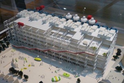
Yesterday Antoine and I visited the Pompidou Centre. Follow that link for the usual Pompidou Centre pictures. Here’s a less usual picture of the thing, in the form of a picture of a model of it that we encountered inside:
I was glad to visit this building, if only to go somewhere out of the cold, which has been extreme (and made much worse by the wind) but which may now be abating a little. Or maybe I’m just getting a little used to it.
I was glad also to get to see, close up, the inside of a much admired, much discussed piece of modern architecture, designed by Renzo Piano and Richard Rogers, Renzo Piano being the man who much more recently has designed London’s Shard. I don’t love all modern architecture, to put it mildly, but I find it a fascinating story.
The Pompidou Centre is an early example of a much practised style of recent years, namely the “structure and services as decoration” style. See also the London Stock Exchange Lloyds of London, designed by Rogers. In this style, architectural organs that are usually hidden inside the body of the building are instead taken out of the body and turned into visual features. As a result of using this style, Piano and Rogers turned what is basically a big urban slab into something a bit more interesting.
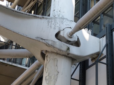
I have noticed that more recent examples in London of this now very common style have started out looking pretty good, but have then started to look … not so good. The trouble with decorative steel work is that it is very hard and very expensive to keep clean and smart, what with it being so very much more complicated than a mere flat surface, and so much harder to get at. And sure enough, there are Pompidou Centre details – details in full view of us visitors – which now look decidedly grubby, or worse.
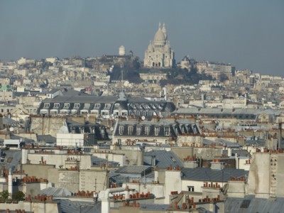
The big outdoor staircase which is such a feature of the Pompidou Centre is a wonderful place to look out across (approximately speaking) the centre of Paris. The view of Montmartre and the Sacre Coeur is, in particular, spectacular.
And thank goodness for the glass, because without it the cold would have been unbearable. But, the glass is rather dirty, and a photographer like me, in among whooping with delight at the views, needs to pick his spot carefully.
And it gets worse. I was actually quite shocked to see things like this:
You expect this kind of run-downness in a now-aging provincial railway station, built in the eighties, given its last face-lift in 2000, and now in need of another. But in a prestige project in the middle of Paris, devoted to “culture” (which the French take very seriously indeed), named after a President? How did they let that happen? Answer: it’s very difficult and expensive to stop it.
I just read the above to Antoine, and he said: It’s the classic problem with a prestige project. There’s a huge photo op when it opens, but no photo op for just slapping on some new paint. Indeed. But, photography by just anyone (by which I mean the likes of me) rather changes that, doesn’t?
Inside the Pompidou Centre there was Art, which we also looked at. I hope to blog about this later, but promise nothing.


The art of refinement…It really really wanted to be a Petrochemical Plant!
You must be thinking of the Lloyd’s Building, the London Stock Exchange is a dull grey concrete box of a building.
I think the problem with impractical buildings such as the Centre Pompidou is that the architects are essentially messing around for the sake of it. Modern design techniques may mean that you can put all the services on the oustide of the building, where they are hard to maintain, but that doesn’t mean you should. Still, if a few black crew neck sweater wearing ponces win architectural awards from fellow wankers, what do we serfs matter?
Interesting to see how the Beaubourg’s coming on. I was resident in Paris in the early 80’s & the paint was already falling off the piping round the back of it then. Restrict my Parisian visits mainly to circling the Peri, these days. Traffic’s appalling in town.
Fascinating how received opinion is usually some version of how Parisians think the thing’s exciting, splendid…. Most folk I knew then regarded it as a pile of merde. From what I gather, that hasn’t changed much. Yep, staircase is good. Plaza in front’s clever too. The slight slope means you can get a good idea of what’s going on around.
Architects.
Since Xmas, I’ve been watching the hotel down the way from me getting a repaint. It’s a 70’s style block. Basically lots of small railed terraces, one to a room, stacked up 10 floors high by 9 along. Added feature is that in the horizontal plane each column of terraces steps back from the next to produce good sea views.
Now for some reason, instead of painting it all one colour, they’ve been painting selected terraces a different one. From where I am it’s given the effect of a blocky diamond shape centred on the middle. Sort of reminiscent of a snowflake. In blue.
The ‘from where I am’ in the above sentence is important. You see I’ve walked all over the area this feature is visible & there’s nowhere else you can see the shape. From the road directly in front of the place, looking past the trees fronting the car park, it just appears the place is in the middle of a colour change. From the beach side that the middle tiers are painted differently. From anywhere else the building is obscured by other structures.
My guess, the guy did the design for this never got any further than the drawings. Didn’t actually walk it. Must have looked good to the owners when he’d done his bit with his coloured felt tips. Trouble is, the only one who’s at the elevation perspective point is yours truly.
That’s how I see Richard Rogers architecture. Looks good on paper. Otherwise? Heap of shit.
I just read the above to Antoine, and he said: It’s the classic problem with a prestige project. There’s a huge photo op when it opens, but no photo op for just slapping on some new paint. Indeed. But, photography by just anyone (by which I mean the likes of me) rather changes that, doesn’t?
Not really. The problems only appear long after the person who commissioned the government building has moved on.
This is the difference with a commercial building – if you build a high-cost, high maintenance building then you’re going to pay for it. If you don’t spend on necessary maintenance, the value of your asset goes down. As a result, buildings for the competitive private sector are designed with maintenance in mind, and typically not as indulgent.
Add up how many Richard Rogers buildings were designed for the competitive private sector and you arrive at something close to zero. Theo Paphitis runs his businesses from cookie-cutter red brick office buildings.
Rumour has it that Lloyd’s are planning on moving out of “The Lloyd’s Building” and moving into the new Leadenhall Building now being build across the road, the reason being that the current building designed by Rogers is getting too expensive to maintain (it now over 25 years old).
Maintenance always looks like a problem with modern ‘fancy’ architecture. Look at those edges, hidden surfaces, joins, curves, and whatnot. I think of those buildings as basically throw away items, like paper plates and plastic eating utensils. They may be good for a decade or three but the money could be better spent on something of long term value.
Nah, out with the old, in with the new – it stimulates the economy, too!
While I started my “Lloyd’s Experience” (whatever that was) at the old “Room” and “Tea Room” (mostly) I was intrigued with Rogers’ concept of “The Room” as a building. But, concepts aren’t always possible, let alone easy, to execute.
And St. MaryAxe is now served with a”Pickle.”
Humans have an instinctive love for the careful and the efficient and an instinctive hatred of the wasteful and profligate.
Old buildings were usually designed and built carefully to maximize the materials and the life of the building. They were marvelously efficient with passive gravity based weather and waterproofing systems of overlaps and flashings.
I doubt there is a modern architect extant who even knows what I write about. Fools, dangerous, disrespectful fools, capable only of producing the ugliness inherent in waste and profligacy. Their attempts to design without any knowledge of their materials are pitiful, and really, they are evil.
Fred, I think you are confusing “foolish” with “evil”.
Not mutually exclusive, Laird.
I am not a cultured man. Alas – I am far from cultured.
But I have noticed something odd about the official French attitude towards culture (or the attitude of “official France”).
France has astonishing cultural achievements – in building, art, music (and so on).
However, there is a tendancy to pretend that every new thing that comes along must be good – and must be taken very seriously.
Not just in building – as with this silly Pompidow Centre, but in a lot of other things also.
For example, I recently listened to a French person (very much part of the establishment) taking about how certain French Rap singers should be included in the Academy Francaise.
North Germans (at least official ones) tend to hae a similar attitude – but Bavarians, Austrians and Italians tend to treat modern stuff with the contempt it deserves.
It is odd for France to side with the northern Germans in cultural matters.
Of course not all new things (in building, art, music, literature) are no good – but things that make a statement of how “modern” they are, useually are no good.
“What of Britain”.
Well what of it?
Add up how many Richard Rogers buildings were designed for the competitive private sector and you arrive at something close to zero.
Oddly enough, though, Renzo Piano (or at least his people) have designed quite a few. He is actually very good at taking what would be a functional office tower and adding a few flourishes to give the building an element of class, without reducing the ease of use and maintenance too much. I read an interview with Piano a few years ago in which he was asked about the Pompidou Centre, and he said basically that it was clearly a project he did as a young man – i.e. showy and impractical, although that wasn’t actually what he said.
Personally, I actually rather like it, but it must indeed be a bitch to look after, particularly given that the sorts of state or state-affiliated tenants who occupy such buildings do often lack the resources or the will or the competence to do this.
Prime example of bad architecture.
The “structure and services” school is of the opinion that one may change an ugly person to “interesting” by moving their internal organs to the outside.
It’s nonsense. An ugly building (i.e. Le Corbusier-style utilitarianism) is ugly, and no amount of lipstick makes the pig look any prettier. The Pompidou Centre is easily one of the ugliest buildings ever conceived.
There are certain people of whom one can say that early assassination would have prevented a multiplicity of later problems, and Le Corbusier is most certainly one of those people.
I am reminded of the Frenchman I met in Paris who was of the opinion that the 9/11 hijackers should have aimed an airliner into the I.M. Pei excrescence in front of the Louvre. They would, he exclaimed, have been hailed as heroes by most of Paris.
Interesting statement Michael.
I had heard that Rogers was fairly useless at the technical side of building (for example his Lloyds building is an absurdity from a practical point of view) – but that Foster at least understood how to build things that do not fall apart.
I actually like some of Norman Foster’s work – for example at the British Museum.
It may be a great waste of space (which could be used much better) – but it is impressive (and I like it).
It reminds of Fascist architecture from Mussolini’s Italy.
Now that is going to be taken out of context to pretent that “Paul Marks supports Fascism”.
However, I am so cheesed off with local government at the moment that I do not really care if it is taken out of context.