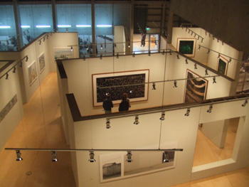
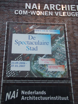
“Spectacular City – Photographing the Future”. Photographic exhibition at the Netherlands Architecture Institute, Rotterdam, until January 7, 2007, and then touring, to the NRW Forum in Dusseldorf and subsequently to further venues.
One of the great things about the internet is that it is possible to start on a familiar blog, and end up not much later at somewhere you would not have imagined being a couple of links before. And sometimes, the virtual world gets left behind, and you end up somewhere in reality you weren’t expecting to be.
For instance, on Tuesday of the week before last, I started at the blog of Willam Gibson (the famous William Gibson), and before I knew it I was simultaneously at the delightful Japan Probe and the website of the Netherlands Architecture Institute, which was apparently featuring an exhibition entitled “Spectacular City”, which was a phtographic exhibition of modern urban buildings, supposedly attempting to reveal things about cities through photographs of their less observed details. The blogged photograph on the immediate link, the Ministry of Transportation in Tbilisi in Georgia, made the exhibition look promising, especially given that I enjoy looking at modern uses of Soviet architecture at least as much as the next guy.
As I am also someone who loves few things as much as visiting suburban shopping malls, housing estates, and transport infrastructure in foreign cities, I was intrigued. I checked the location of the architecture institute in question, and was gratified to discover that it was not in Amsterdam but in Rotterdam. This is a fitting place for it. In the sense of modern architecture, Rotterdam is one of the more interesting cities in Western Europe, although one or two Spanish cities have been making a good claims recently. The combination of a city completely flattened by bombing, and a lack of the architectural timidity of London or the pomposity of Paris (and the perhaps not coincidental fact that Rotterdam post war became one of the key points of European transport infrastructure – more on that in my next post) led to a really interesting, experimental, and modern (in the best sense) city being created.
However, the real reason I was gratified was that it meant that the exhibition was relatively easy for me to visit. By a strange coincidence, I was planning on being in Antwerp a few days later, in order to go to the slightly naff Belgian/Dutch/German version of Night of the Proms, which is somewhat less musically rarified and much more poppified than the British version, but is none the less rather good fun. That took me up to Saturday night, and my train ticket back to London was for Sunday evening. My plans had been to spend most of Sunday pottering around in Antwerp – a nice city for it – but Rotterdam is only an hour north by train, and there was nothing stopping me from nipping up to Rotterdam on Sunday and having a look for myself.
(Quick summary of the Belgian Night of the Proms: given that Tears for Fears were a band with two strong vocalists who wrote and performed somewhat overblown songs with a huge instrumental backing, they are never going to be better than accompanied by a full orchestra, a 40 strong choir on the back of the stage, three aesthetically pleasing front of the stage backing singers, and assorted drummers, pianists, and other musicians. Given also that there are a band whose repertoire really only consists of three really good songs and about four or five good ones, not terribly much is lost through their sharing a bill with other performers. On the other hand Texas are a group of slightly more musically sparse Glaswegians, and are probably better by themselves with a full set: more songs, less embellishment, and fewer distractions. Also, when they were performing the three aesthetically pleasing backup singers had changed into the most interesting of their thirty seven different costumes for the evening: outfits consisting of rather tight jeans and red corsety things that were probably illegal in Korea until recently. Male weakness meant that I was distracted. But none the less, it was a fun evening. It may not have been as fun if it had been in London, but Belgium was the right place for it).
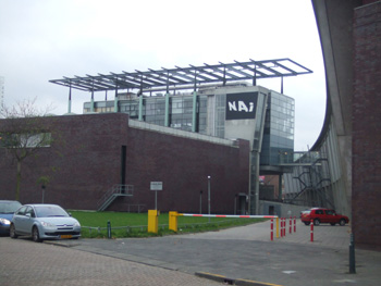
In any event, architecture. Rotterdam. If you are a building, being the Netherlands Architecture Institute is probably like being the Vienna Philharmonic if you are an orchestra. Everybody expects you to be the Vienna Philharmonic. This is probably a bit much on an evening when you have been to the pub and have had one too many. And the NAI is a decent building trying a bit hard, but nothing really special.
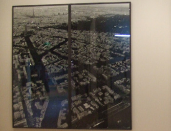
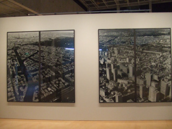
Walking into the building and into the exhibition the first thing I saw was an aerial photograph of Paris inside the Periphique: the Eiffel Tower, the wide Boulevards designed by Baron von Haussman, practically picture postcard stuff
.
I steeled myself for disappointment with respect to the exhibit. Paris inside the Periphique is not a city that has grown from its lesser observed pieces. Paris inside the Periphique is a city in a corset, almost literally, although in this instance of a kind legal (and probably fairly common) in Korea. The city is full of legally protected buildings, height restrictions, prohibitions on selling newspapers in cafes, and worst of all, buildings owned and designed by governments. There is modern architecture, but it is monumental and government sanctioned. The city boundary corresponds with the aforementioned Periphique, an elevated motorway that surrounds the city, seemingly holding the picture postcard Paris within. The City is just a museum – it is full of governent but does not seem to have any sort of functional wealth generating economy within. It is beautiful, but it isn’t interesting.
Paris outside the Periphique is much more interesting. It is fashionable to decry the ugliness of Paris’ suburbs. They are of course notorious for their ghastly housing estates, and for the riots of last year that took place in some of them. The French word for suburb, banlieu, has almost become a dirty word. But the situation is vastly more complex than that. It is indeed true that some suburbs are unspeakable centrally planned and now practically ungovernable housing estates. But the first impression one gets when walking under the Periphique is that here is where the actual economy starts. One finds budget hotels, car repair stores, markets selling African masks, retail parks, Asian supermarkets, working class neighbourhoods full of ordinary people who can’t afford to live in Pairs proper, all kinds of things that are discouraged in Paris itself. There is unbridled capitalism here.
There is also bridled capitalism here. There are planned, gated, fearesomely rich suburbs. There are factories, low rent office spaces, medium rent office spaces, high rent office spaces. Of all the places on Earth, the one that most resembles a William Gibson novel may well be Paris.
But walking into the exhibition in Rotterdam, I didn’t see this. I saw the pretty, ordered Paris of von Hausmann. It surely wasn’t going to be this big a yawn? As I walked in I saw another identically sized portrait of some other city beside Paris. Okay, the plan was to present Paris beside some other, less ordered city, was it. I walked to the label at the side of the pictures and read the descriptions. 1. Paris, 1998. 2. Paris 1998.
So the point being made was the one I had just made in my head and have just made on this blog. Ordered Paris versus its unruly suburbs. And it was presented in such a way that the unruly suburbs were being obscured when you first walked in, probably intending to inspire the precise double take it inspired in me.
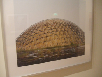
So, the main pont is that this may be an exhibition by and for architects (who as a rule are keener on the centrally planned than am I), but it is from smart architects. Having got to that point, there is perhaps relatively little left to say. With a title “Spectacular CIty”, a surprisingly large amount of the exhibition was not in truth about cities. There are a few slightly pretentious things of things like the inside of CERN or agricultural land in South America, presumably because the curators like the look of them (or something). I will forgive this, but in a few instances a sin was committed that I consider to be almost unforgivable for this sort of exhibition: a photograph of an urban environment was presented without stating where in the world the city in question was. Cities are places. All of them have their own unique personalities and signatures and feelings and moods, and the built environment is only part of that. Putting the buildings above the place is wrong, and leads to artistic folly. It also makes it hard from those of us whose response to being particularly taken by a photograph of a place in an exhibition like this is to go and look at the place. Where is this, for instance? I have no idea. But there I can conceive of cicumstances in which I might want to go and look at it.
I think there was possibly a little too many photographs of things in the former Soviet Union for an exhibition about the modern and explicitely spectacular city. I agree completely that there are lots of weirdly photogenic and even occasionally wonderful things in that part of the world, and even that the question of what happens when you build on top of them with modern materials, design, and architectural techniques can be at best fascinating (and I have a few photographs that I have taken myself of things weirder even than anything in this exhibition) but this is in most ways a dead end. The former Soviet Union is not the spectacular future of the city. Moscow today is apparently a boom town filled with cranes, but that is a chimera. The oil and gas boom will at some point end. There isn’t a self-sustaining economy at there, and the best case scenario for the next couple of decades is a horrendous cycle of boom and bust. More interesting stories are to be found in Asia, which although covered, was I think underdone.
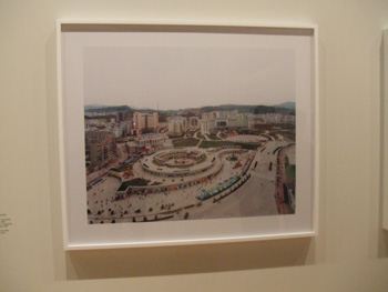
Get used to this kind of picture. (New Fengdu, Chongqinq Municipality, China). This kind of urban environment is going to exemplify China in the decades ahead. Cities and countries develop a certain character based on what is “modern” at the moment a certain bulk of the built environment is built. (London is defined by the Victorian era. New York is defined by the years between the construction of the Brooklyn Bridge and the Empire State Building. One of my favourite European cities, Porto, is defined by the Art Deco era). China’s moment has been the last ten years, and it is full of cityscapes like this. At the moment, western movies and television programs filmed or set in China are focusted on the modernistically glam parts of the country or of some vision of the bast. The mundane has not yet become the Chinese mundane in non-Chinese popular consciousness, but it will. And this is the mundane. India’s built environment has not yet reached that crucial moment. When it does what is modern will have changed, and India will have a quite different look from China. What it will be remains to be seen.
Oddly, when I left the “Spectacular City” exhibition, and visited the NAI’s normal galleries upstairs, most of one whole floor was devoted to a discussion of Neither town nor country in the Netherlands. The point was that prior to about 1950, the Netherlands had been divided between obviously urban places, and obviously rural places. The observation that such things as large retail, associated leisure industries, light manufacturing and dirtier or more space intensive services than are tolerated in explicitely defined cities However, with the inevitable decline in the importance of agriculture, many parts of the country could be described as neither urban nor rural. In truth, in these displays the words are rather more interesting than the pictures.
That’s a favourite rhetorical trick of politicians in my native Australia, to be truth. “<Something or other>is “un-Australian”, and therefore being in favour of it is against everything that we in this country hold dear. As if that was in itself an argument. And heaven forbid degeneration into a collection of leisure industries. (How do the people participating in leisure activities feel about this?)
Well, three cheers for the local authorities that welcome private enterprise. Though please, oh Lord, no hard boundaries between the urban and the “Green”. That way lies London, and while my love of London goes deep into my soul, the “Green Belt” around the city is the worst piece of planning in the city’s history. Almost alone, it is responsible for London being probably the most expensive city in the world. London is the great white collar services city of the world, but the green belt almost by iteself prevents the economy from being more diverse than that and ensures that teachers and policemen practically starve. The green belt is almost sacrosanct if you talk to a Londoner about it. You suggest it should be abolished and they are generally appalled. You then ask them what it consists or when they last visited it, and you generally get incomprehension.
And of course a hard boundary is what the Periphique surrounding Paris is.
Actually, some of us might find something to cherish in it. (Perhaps the people participating in leisure activities).
I could make fun of statist architecture speak for hours, but that would actually not be fair. In truth, the observation and reflection found here are rather more positive than would be found in an equivalent exhibition in such an institute in Britain. The bookshop in the institute was full of an interesting (and extremely international) selection of eclectic architecture and design books. And the exhibitions upstairs and downstairs were ultimately about the same thing – how urban and semi-urbal environments are now forming out of market forces and rather clumsy attempts to direct them. I don’t know if they connection was intended. But together upstairs and downstairs made for an interesting afternoon.


Fascinating. Please write more on your architectural observations. Although I love visiting cities, and have always liked Paris, I had never seen it in quite the way you have described. Your comments really opened my eyes. I had one of those “why did I never realise that before?” moments. And your comments on the exhibition lables were also enlightening. Thanks.