While delighting here in the new camera I bought early this year, I included a picture of a new building, then being constructed in Victoria Street, London SW1, near where I live. 62 Buckingham Gate is now nearly finished.
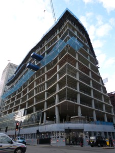
In February, as already show in that earlier posting, this was how it was looking:
There was a time when a building which looked like that when it was being built would end up looking pretty much like that when finished. This was the time of such architectural enthusiasms as “New Brutalism”, a time better know to civilians as the age of Concrete Monstrosities.
And that building above would have carried on as the misshapen oddity that it was when being constructed, looking like it had been put together by a bunch of builders who got drunk every breakfast time, while supervised by an architect who was suffering from a nervous breakdown.
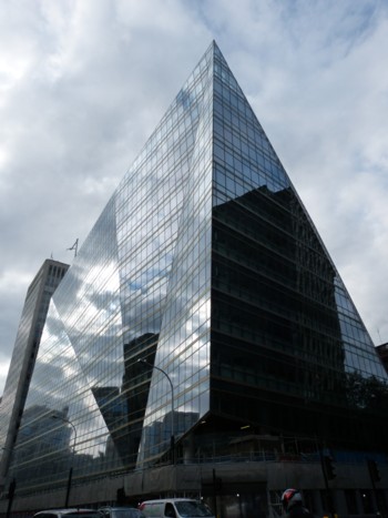
But now look at it:
Yes it’s another contribution to the Buildings That Won’t Show Up On Radar style, already noted in an earlier posting I did here about One New Change. Here is another example of the style.
Partly, as I already mused in that One New Change posting, architects now do this kind of thing because they can. Whatever new thing they can do at any particular juncture in architectural history tends to get exaggerated and turned into a style. And they can do this kind of geometrical weirdness because now they have computers to enable them to keep track of it all, as they did not during the Concrete Monstrosity era.
They also have better technology, including such things as greatly improved glass of many different kinds, from which they can pick the exact one that is most suitable for their particular building.
But there is also a deeper change in play here, a change of aesthetic philosophy. One of the ideas behind the Modern Movement in architecture was a profound puritanism about the idea of a building looking beautiful. Strange to relate, architects were actually, sort of, against this. Reacting fiercely against what they saw as the mass-produced decorative excesses of late Victorian architecture, mid-twentieth century architects demanded buildings which looked from the outside what they truly were on the inside. They abominated external decoration, rather as earlier puritans had scraped away all the colourful decoration in churches, or who had cursed the elaborate make-up worn by wicked women. To switch metaphors slightly, these architectural puritans wanted buildings that were all rectangular bone, but with no flesh or skin superimposed.
This was where phrases like the “New Brutalism” came from. This was not a nickname given to an architectural style by hostile reactionaries. The New Brutalism was what the self-proclaimed New Brutalists called their own preferred way of designing buildings.
But this puritanical phase passed, not least because clients rebelled. As did the wider public. My personal theory is that architects got fed up with being abused by strangers at parties, and decided that they would go back to making buildings that got people saying “Wow!” again, instead of “Urrgghh!” But they didn’t want to accomplish this by ignominiously abandoning their twentieth century ways and going back to mere retro-Victorianism. They wanted buildings to be beautiful, and to be popularly acknowledged as beautiful, but still in a modern-looking way. Hence the look of this new office building in Victoria Street.
A consequence of this desire to make buildings look stylish, rather than merely cloddishly rectangular – “honest”, as the Concrete Monstosity architects used to put it – is that buildings nowadays typically look, as did 62 Buckingham Gate, very different when finished to the way they looked while being constructed. In their own modern way, buildings are now back to wearing make-up.
The way the new sort of glass now looks on the outside of buildings is crucial to the change of aesthetic. Concrete Monstrosities did have windows, by the acre. But the glass in them was usually as transparent as possible, to allow the structure of the building to be clearly – “honestly” – visible from outside. But the more recent trend is for the glass to conceal structure, and to have the surfaces of the building create effects of their own, by reflecting light rather than merely allowing it through unmolested.
As comments on this posting may perhaps illustrate, not everybody cares for this new style. Many would prefer the status quo ante, before modernism of any sort got into its stride. But personally, I am impressed. The only thing I really regret about buildings such as this one is that there will be so few such new buildings like this in London, for the foreseeable future. The same economic boom which funded these buildings is inevitably being followed by an economic bust, which will bring pretty much all architecture other than the most humdrum to an inglorious halt, in London as almost everywhere else.
Further architectural activity is promised for the Victoria area, 62 Buckingham Gate being towards the right in that picture. But although I will continue to snap away at new buildings in my vicinity as they rise up, I will be doing this more in the hope of more Wow! buildings, than in any great expectation.
Final thought: Well done the internet, for allowing me to learn about new buildings with almost zero bother or expense, just as soon as they start getting built. Time was when it was all you could do to learn about a building that had been around for years. Now, noting and learning about new buildings as they materialise is a doddle. Typically all I need to do these days is photo the proclamations on the outside of the building site, which typically include mention of the more modern sort of site, a website. And away I go.


“.. including such things as greatly improved glass of many different kinds”
I do hope that includes the self-cleaning variety!
Call me a hopeless Philistine, but buildings ought to go more or less straight up and down because people go more or less straight up and down.
Supposedly, Ian Fleming named one of his best known villains “Goldfinger” as a dig at the architect Erno Goldfinger.
@PFP: In the case of women, only the very skinny and the very plain.
This Geometrical Weirdness is all a bit Cthulu.
Maybe The Architects are preparing our cities for the return of The Old Ones.
We can but hope, George, we can but hope…. 😛
I did say “more or less:” vive la plus et la moins!
Simon Jester:
I’ve heard that story as well. Apparently Goldfinger complained to Fleming, who retorted that he would change the character’s name to ‘Goldprick’.
FWIW, I rather like it. It’s certainly a vast improvement over the ugly New Brutalist style.
Minimalism is nothing more than evidence of a paucity of imagination.
Steampunk uber alles. 😉